Thursday, 10 May 2012

Final Music Video & Ancillary Tasks

Music Video:


This is my final music video - I have made some changes from my first draft based on the target audience feedback. This includes shots that are stable as I used a tripod. Also, I have included more narrative, seen when the singer is written down lyrics showing she is reflecting on her memories with someone she loves. Narrative can also be seen in the shots when the singer is isolated, as the lyrics of "When I'm Alone" so it reflects her thoughts about when she spends time with her lover.

Digipack:


Poster:

Friday, 30 March 2012

Evaluation Question 4

How did you use media technologies in the construction and research, planning and evaluation stages?


I used many media technologies throughout my course, including Youtube, social networking sites, Blogger, computer programmes and camera equipment in order to create my final music video, digipack and poster. All these media technologies were very useful and helped me to create something of industry standard.


YouTube has been an essential part throughout my course. In research and planning, I used YouTube to research existing music videos of all genres, and then focused on my chosen genre of acoustic and indie. By looking at existing music videos, I was able to focus on the codes and conventions of the genre at an early stage. These conventions included the use of costumes, props and locations. Also, I uploaded videos of my animatic, time lapse experiment, equipment video and auditions, which are now broadcast to a worldwide audience. Additionally, I used YouTube in my evaluation as I used a movie format for an evaluation question, so it is was more appeal than reading it on a blog. 

Social networking was key to all stages of the course. Firstly, we used sites such as Facebook to contact our actors and actresses, therefore making it easy to organise which days you were going to film. Facebook was also used as a target audience, as I posted a survey during the research and planning stages to see people’s favourite aspects of music, particularly linked to props, location and narration. Additionally, once I had uploaded my music video to YouTube, I put a link on my Facebook page making my music video more accessible to find and also to receive feedback.

I used Blogger since the start of the course to show my progress throughout planning, researching, construction and evaluation. I also customised my blog so it looked more attractive and appealing so people would want to read it more. 

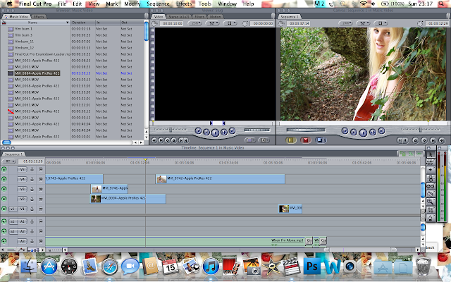
Equipment was also key throughout the course. This includes a Canon 7D camera, a Mac computer and MacBook (along with a mouse, keyboard and screen) with the programs Final Cut Pro, After Effects, InDesign and Photoshop on it. This software and hardware thoroughly helped to create effects of industry standard, such as cutting the clips to the beat of the song, which is essential for a music video. On Final Cut Pro, I was also able to add effects, such as light leaks to make it look more professional. If technology were not so advanced, I would have faced many problems, which consequently would have altered the quality of my music video.

Evaluation Question 3

What have you learnt from your audience feedback?


Once I had uploaded my music video to my youtube channel, I could then post a link on my Facebook page. This allowed my friends to view it and also give their feedback on what aspects they liked or disliked.


I also made a survey on www.surveymonkey.com, where I asked questions about my music video.


Here are the questions and responses...


I like the different locations and the different camera angles
4/16/2012 9:32 PMView Responses
I really like the natural locations and also loved what the singer was wearing as it fit well with the genre.
4/16/2012 9:30 PMView Responses
I liked the shots from different angles and the way that there was a variety of loactions. I also LOVED what the girl was wearing and it fit nicely with the surroundings! The singing was all in time with the track and the switches were nice and simple and not overly complicated.
4/16/2012 9:16 PMView Responses
nice camera shots in nice locations
4/16/2012 9:16 PMView Responses
Everything! Especially the visuals and storyline
4/16/2012 9:14 PMView Responses
The different view points & camera angles.
4/16/2012 9:11 PMView Responses
i liked the setting and different shots, it was really natural and seemed to fit the lyrics and genre of the song
4/16/2012 9:09 PMView Responses
I like the way it switches from different scenery in the video. I also love the fact she is mimicking the words and also playing the guitar.
4/16/2012 9:09 PMView Responses


If I was being picky, I think the shots could have been a bit more steady, however in fact they add to the playfulness
4/16/2012 9:30 PMView Responses
Sometimes the camera wobbled and moved, which if it was held steady would improve the quality. I'd have liked a few more long distance, and extreme facial close ups - the camera distance tended to all be from the same sort of distance.
4/16/2012 9:16 PMView Responses
maybe find a way to improve the cameras stability, but apart from that it's good!
4/16/2012 9:16 PMView Responses
Nothing. I loved it all - soo good!
4/16/2012 9:14 PMView Responses
You could maybe do more close up shots of the singer?
4/16/2012 9:11 PMView Responses
maybe make shots more stablized
4/16/2012 9:09 PMView Responses
There was a little bit of giggling, but then it does add fun to the video so not necessarily a bad aspect of the video.
4/16/2012 9:09 PMView Responses


As you can see from the comments above, it generally received positive feedback. They liked the use of locations, costumes, props and range of camera shots. I also asked what they disliked, so I could improve and create the best music video possible. Most people commented on the stability of the shots, I agree with this to a certain point as some shots need to be more steady, however I wanted to create a fun and carefree feel, similar to 'Our Song' by Ellie Goulding. Overall, I have taken all feedback and criticism onboard, and as a result I have decided to re-film some parts at St. Catherine's breakwater and woods with a tripod to ensure that the footage is stable, so it will look more professional. Also, I have decided to include a narrative, in order to add another aspect to the video, as well as make it more interesting for my target audience to watch.


During the research and planning stage, I used surveymonkey to collect information of the typical target audience expectations for an acoustic and indie music video. I found out that the typical costumes expected were floral dresses, denim jackets and jewellery, and for locations it was expected to see beach and woodland areas. Therefore, I decided to stick to these expectations as they most appeal to my chosen target audience.
Once I had uploaded my music video to my youtube channel, I could then post a link on my Facebook page. This allowed my friends to view it and also give their feedback on what aspects they liked or disliked.
I received feedback that I need more stable footage as well as to include a narrative. Therefore, I filmed some more footage, in order to make my music video reach the expectations of my target audience. 


Evaluation Question 2

How effective is the combination of your main product and ancillary texts?


Evaluation Question 1

In what ways does your media product use, develop or challenge forms and conventions of real media products?


Applying Andrew Goodwin’s Theory:
  1. The use of natural locations, like the woods and beach are also seen in real media products of the acoustic and indie genre.
  2. The visuals both illustrate and amplify the lyrics in my music video. An example is when the lyrics say ‘When I’m Alone’, so the visuals illustrate the singer by herself, showing her isolation and reflection on this relationship. Also, the song is very rhythmical, so there are fast paced edits to match the beat of the song and to make the video more interesting.
  3.  The visuals in my music video are either illustrating or amplifying the music, for example, there is a heavier bass in the chorus, which is illustrated in my video through a faster pace in the change of shots. There is also use of an overlay and light leaks at this same moment, which amplifies its rhythm. Also, I have included the use of a guitar as a prop as this visual amplifies the music as it shows that this is an instrument being used in the song.
  4. In my music video, I have included close-up shots of the artist, as it is a demand of record label. Also, there is a range of other shots of the actress/singer to add variety to the video and make it more interesting to watch. 
  5.  There is no reference to the notion of looking through screens within screen or telescopes, however the artist does look at the camera, which suggests a connection with the audience. There is also no voyeuristic treatment of the female body as it doesn’t fit within this genre of music. I have portrayed her as a playful character as I have used shots of her laughing and playing in the woods.
  6. The costumes used in my music video have references to both acoustic and indie artists, such as Lissie, Taylor Swift, Lana Del Rey, Colbie Calliat and, Marina and the Diamonds. The use of locations and props is typical to this genre of music, especially scenes at the beach and in the woods and also the use of a guitar.

Construction - Ancillary Tasks & Music Video

Ancillary tasks:

For both my poster and digipack, I had to take photographs of my actress. I took the majority of my photos whilst I was filming at St. Catherines breakwater and woods. I also took photos at St. Ouens beach, where she wore a different outfit, which will add variety to my shots.
Here are contact sheets of the pictures:

St. Ouens...


St. Catherines:


Overall, I prefer the pictures I took at St. Catherines breakwater and woods, as I like the lighting and location. I also prefer the outfit chosen, as I feel it suits the conventions of an acoustic/indie music video. For my poster and digipack, I have decided to use most of the pictures taken at St. Catherines. However, I will also use some locational pictures from St. Ouens to add variety.


Using a 4 panel layout template and CD cover template, I was then able to create my digipack on InDesign.


InDesign allowed me to create a digipack that resembled I looked at in my research section. For example, I used the 'Type on a path' tool on a circle shape in order to put the text around the rim of the CD.


In order to make my digipack look as professional as possible, I downloaded a font that was similar to the conventions of an acoustic/indie artist. On dafont.com, I download the font 'Sunshine in my soul', as  acoustic and indie artists in my research used a similar font.


Also, I  download brush effects for PhotoShop from www.brusheezy.com so I could create an interesting effect.


For my digipack, I used a continous colour scheme so it looked professional. I used the same font for all information, as I felt it made it look more professional. Additionally, I added a barcode, music production company logos, the artists website address and copyright info, to finish.


For my poster, I used a picture from a different location so that there was variety in colour. I included the HMV logo, to make it look as though it was a real HMV poster.


I also used the conventional HMV font.


I also used the same font that I used for the digipack to show it is her signature font.


Music Video:

I compressed my footage, using Compressor, in order to speed up the process when I was editing in Final Cut Pro, as it meant that I didn't have to keep rendering the footage. Once I had dragged the footage I wanted to compress into the programme, I chose Apple ProRes 422 as the setting.


Once all footage was compressed, I imported the footage into Final Cut Pro so I could edit it. I made sure that it looked like my actress was lip-syncing to the song and I also created made the pace of shots quite fast so it matched the beat of the music.