Sunday 25 September 2011

Digipak Research

These are some digipaks for acoustic/indie artists. I have picked digipaks that are similar to what I want my digipak to look like.

This is the digipak for Coblie Caillat's album called Breakthrough. The front of the digipak is a medium shot of the singer, where a shallow depth of field has been used. The costume fits the convention of the genre. The font is used on the front, back, inside and on the CD, making it look very professional. On the CD, an effect has been used to make it look like wood. On the back of the digipak, the names of the songs are seen in the same font. Another shot of the singer has been used in the same costume to show continuity. In addition company logos, barcodes, copyright and album info is on the back of the CD. I really like the natural feel to this digipak, and these images are what you would typically see in her music video, so she is presenting a continuing theme.

This is the digipak for Lissie’s album, which is self-titled and common for a first album. The front of the digipak is a closeup of Lissie, where the wind is slightly blowing her hair giving it a natural feel. The colours used are very also very natural so fits in with the conventions of her genre. In addition, the font used is seen on the font of the disk, which uses a baby blue that is calming. The third picture is from the album booklet, this shows a fun and playful side to the singer as she is laughing. I like how the picture is taken on an angle. The back of the is the same location as the front of the digipak, showing the continuity in themes and setting.

This is the digipak for Lungs by Florence and the Machine, which is titled Lungs. The lungs are presented on the front and back of the digipak. On the front, the main singer, Florence, is wearing a necklace that has lungs. This symbol of lungs is also shown on the back where each song is labelled to a part of the lungs. The disc is very simple and only uses a picture with text stating the name of the album. The third picture is from the album booklet, it very simple but effective as the use of depth of field draws our focus to florence rather than the background.

This is the digipak of Marina and the Diamonds album, The Family Jewels. I really like this album as it uses varying shots of the main singer. The front of the digipak is a headshot, with the text in white, which really stands out. The disc is very simple as only a border and the name of band/album is shown. This allows the pictures of the front/back and booklet stand out. The third image is really effective as it is an action shot of her moving her head. The back of the album is very unique as she is in a very unusual position, which is not commonly seen on albums. I like this as it shows that she is different and wants to stand out.


I really like all these digipaks and would like to incorporate different features of each one. I really like the soft natural feel to Colbie/Lissie's album, however like the edgy and unique feel to Florence and the machine/Marina and the Diamonds. I think I would like to use a mixture of these effects.

Poster Research

These are some typical music poster for acoustic/alternative artists that I like the look of and have inspired me for my own posters. 


This is the poster for Foster the People's tour in Australia. The use of bright colours in the background creates a silhouetted effect on the band members. The information included is the date, where the tour is, where you can buy the tickets, the digipak of the album, and company logos that are involved in the tour. I really like the use of colour in this poster as it really stands out. I also really like the text as it is really simple but stands out.


This is Lissie's poster for her your in Stockholm. This poster is very simple to replicate as it is a poster of a corn field, with an effect added on top. The colours are very light and natural, which matches the typical conventions of this singer. The text "Lissie" is the same font seen on her album and single covers, showing the continuity. The other text is in a different font to show a distinction. This text is bolder to draw the audiences attention to where is being held.


This is Colbie Caillat's poster for her tour at Newport Music Hall. This is very simple but effective, and think I could replicate something similar. A photo has been taken of the singer, then edited in Photoshop. I like the natural feel to this poster as it is very relaxed and natural. The use of orange really pops and makes the poster stand out.


This is Ellie Goulding's poster for her album 'Lights'. The album is pop, with elements of acoustic. This is a typical poster that you would see in a shop, such as HMV. The poster includes the digipak of her album, as well as reviews, company logo and information about the album. The poster is very light and natural, using colours of yellow, green, brown and white. I like the use of depth of field, as the singer is in focus and the background is out of focus. Lighting has been used to emphasise the name of the album.


This is Florence & the Machine's poster for advertising. The use of lighting is in the centre of the poster behind the singer, which draws our focus to the singer rather than the background. Also, the prop of the big moon which she sits on is seen in her music video for "You've Got The Love". The text is very elegant and fits with the theme of the poster. I really like how it is simple but stands out due to the strong contrast between the light and dark background.

Research 11 - Acoustic

Lissie - When I'm Alone


This is 'When I'm Alone' by Lissie. This music video is how I imagine my music video to look like. I really like the variety in shots used, as well as the different locations which are incorporated. Most of all, I like the natural and careless feel as the singer has comfortable clothes that still fit with her style of music and also, she wears little make-up showing she is comfortable in her own skin.


This is a medium of the singer, showing a desert-like environment. There are warm filters being used that gives this video a warm/summer feel.


This shots shows a second location which is seen through out the music video. It is set in a metal barn, but holes have been cut into the wall, so the light shines through. These rays of light really stand out against the black background.


This is a closeup shot of a car. A lens flare has been used, developing the natural/warm colours of the sun, creating a rustic/vintage feel, suiting the artist well.


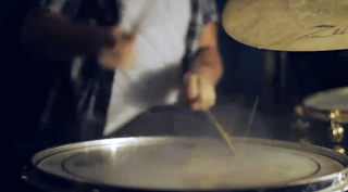
This extreme closeup of the drum, emphasises the drum beat in the song. This shot is set in barn, as the light is shining on it in random places.


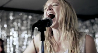
This shot shows the intensity in the singers face as she sing, but also highlights the element of lip-synching. The use of a live performance, adds variety to the video, but also makes it more grungey.


This is one of the ending shots. The sunlight coming through the holes in the barn are really strong now, which mirrors the intensity in the song. The light is so strong that it is creating a blurred effect.

Saturday 24 September 2011

Research 10 - Acoustic

Colbie Caillat - Kiss the Girl


This is 'Kiss the Girl' by Colbie Caillat. In this video, there are many varying shots to show facial expressions. Also, the shots are very light and natural to reflect the mood.


This is a long shot of a room full of pictures. This idea was also seen in Taylor Swift's music video. I really like this concept as it represents memories. The plain background makes the photos stand out more.


This is an extreme closeup of the singers face. There is use of depth of field, where the foreground and background is out of focus, and her face in the centre is in focus.


This is a long shot of the singer walking through the city, where she takes photos of people as she walks past them. The camera is very old fashioned, which adds to the mise-en-scene. Also, the clothing the singer is wearing is very simple, so the focus is on the setting.


This is a change of location, showing the singer playing the guitar. I like how she is in focus in the background against a plain background so she stands out. In the foreground is the camera, which is out of focus.


This is a closeup of the singer playing the guitar. I like how it is very light and natural, reflecting the happy mood of the song.


This shot represents a photo that the singer has taken. It is in black and white, which represents that it is a photo.

Monday 19 September 2011

Research 9 - Acoustic

James Blunt - Stay The Night


This next music video is 'Stay The Night' by James Blunt. It is set on the beach, and uses lots of natural imagery, which is very calming and relaxing to watch.


The first shot is of waves crashing then goes to this shot, which uses text to introduce the artist and song. The sound of the sea instantly is very calming, and sets the audience up for the rest of the video. I like how clear and brightly coloured the sea is, making it very picturesque. Also, a waterproof camera would have been need to shoot this video.


This is a closeup shot of James Blunt playing the guitar, instantly linking it to the genre of the song, which is acoustic. In addition, I like how you can see the sun reflecting on the guitar, showing that it is a nice day, which works well with the genre, as a sunny beach scene is a typical convention.


This shot uses subtle depth of field, where James Blunt is in focus and the guitar is slightly out of focus. Also, this shot is very calming, which works well with the genre.


This is a long shot showing the beach. It is very sunny, which is emphasised by the sun reflecting in the camera lense. The colours on the beach of the chairs, clothing and towels are all very bright, which works well with the conventions of this genre as it creates a very calming and happy atmosphere.


This shot is very romantic, which conveys the narrative of the song. I like the fact that you can see the two peoples silhouettes, which is emphasised by the sun relflecting on the sea behind them.


This is a medium shot showing James Blunt playing the guitar, which is continued throughout the music video. The main focus is James Blunt, as depth of field is used to blur out the people in the background.

Research 8 - Acoustic

Benjamin Francis Leftwich - Atlas Hands


This is 'Atlas Hands' by Ben Francis Leftwich. This is an acoustic music video, and the type of conventions you would expect to see, would be: range of shots, light/natural imagery, props and a narrative which could involve the singer, or not.


This is the opening shot, showing a shadowed beach. I really like this effect, as the sun is rising in the distance to reflects of the stones on the beach.


This is a closeup shot of a girl plaiting another girls hair. I like how it is very natural. Also, I like how the wind blows the girls hair in all directions, making the video seem less polished and more fun.


This is use of depth of field, which changes focus from the netting to the girl. It emphasises the theme of the music video, as a group of people are making a toy boat.


This is the final shot as it shows them taking their boat to sea. I really like the sun setting in the background, behind them as it creates a silhouetted effect and also shows how they have been working all day. The colours used here are very light and natural.

Research 7 - Acoustic

Ben Howard - Keep Your Head Up


This is 'Keep Your Head Up' by Ben Howard. This is an acoustic song, and shows many typical conventions that would normally be seen in an acoustic music video. Natural imagery is used, seen through location and props.


This is the opening shot, which uses shallow depth of field as the foreground is in focus, whereas the sun is blurred. The use of bubbles gives its it a childish feel, but is also creative, and think I would like to replicate a scene like this as it creates a calm vibe.


This again shows the bubbles. Their is a silhouetted figure in the background walking past, giving a sense of ambiguity to why he is carrying a shovel. The sepia tones are due to the set rising, showing it is early in the day. The bubbles are see through so the person is still seen but gives it a cool effect as the sun reflects on the surface on the bubble.


The person is seen a little more clearly as the sun is shining right behind him. I like how the sun reflects on the lense. Also, the colour of the sun here is very bright and really stands out.


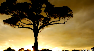
This shot is very natural and picturesque. The sky is really cloudy and dull, but where the sun is setting, it is really bright. The silhouette of the tree is very picturesque, and it really stands out.


This is a shot from looking up from under the water. It is as if a camera has been put in the bucket, where he is getting water to show his face.


This shows a childish manner of the character, as he throws hay barrels. I like how it is slowed down emphasises the hay spraying out of the barrel. The colours seen here are very natural and pure.


This again shows a very childish attitude. Two other people are seen sitting on the tree, swinging their legs. The colours are very natural again. Also, there is use of depth of field here, as the two people in the foreground are in focus to show their body language.


This shot shows finally why the man was carrying a shovel/hay barrels and other equipment into the woods. It again shows a childish but fun way of life.


This shot is taken behind the person sliding, so someone was filming whilst on slide. This shot is very action packed as the camera follows the movement of the slide, so sways and moves in all directions.


This shot is taken as if this character is holding the camera. It is very effective as you are able to see his facial expressions, which shows a lot of joy. Splashes of water and bubbles are also seen showing how fast they are going down the hill, but you also see the bubbles, linking to the beginning of the video.

Research 6 - Alternative Rock

Foster The People - Pumped Up Kicks


'Pumped Up Kicks' by Foster The People, is the genre of alternative rock. The typical conventions of this genre are mainly focused on the band, including live performance. Normally, the video is filmed in a big open space and effects are used, such as scratched or black and white, to give it a grungey feel.


This first shot focuses on the band, showing that the convention of having shots of a performance from the band is very important. In this shot, depth of field is used, where two band members can be seen playing the drums and keyboard. The lighting brings the focus on these bands members against the black background, drawing the audiences attention straight away to the aspect of the band.


This shot adds variety to the video, due to the location and lighting. The silhouettes against the setting sun brings a natural feel to the video, as the colours are very calming and reflects the mellow tones in the music.


This shot shows the audience who are watching the band perform. The atmosphere seems very energetic as the audience are dancing. Also, the video shows a dark/grungey vibe, which creates the "rock" atmosphere. As well as giving it a feel that it is not polished, which relates to the alternative rock conventions.


This shot focuses on the instrumental part of the song, where keyboard/drums/guitar are seen. A blurred effect is used, which ties in the convention of the alternative rock genre, as it brings a different effect to the lighting by dulling it out and making it more mellow.


Again, the natural feel to the video is shown again in this shot, where the band members are seen surfing. The use of black and white emphasises the alternative rock genre as it gives it a grungey feel.


The scratching effect and pale colours further emphasises the alternative rock conventions. The carelessness and sense of rebellion of jumping off a cliff into the water makes it more grungey, but also adds variety to the shots, gripping the audiences attention.


The final shot shows the lead singer finishing on a big note. His mouth is wide open and his eyes are closed showing the intensity. The lighting behind really draws attention as it is very bright. This shot blurs as the music fades out, then finally goes pitch black.

Research 5 - Pop

Rizzle Kicks - Miss Cigarette


This is 'Miss Cigarette' by Rizzle Kicks. Many camera shots are used, such as pans, dolly track shots, crane shots and tilts are used to follow the movements of the singer/band or dancers. Artificial lighting is most common type of lighting used in pop music videos as it helps to enhance the look of the artist or band. Lighting also enhances the atmosphere as it can be used to give a bright and upbeat feel particularly in dance/pop music videos. Also, the costume reflects the genre of the music and style of artist. In addition, sometimes there is use of diagetic and non-diagetic sounds used.


This is the opening shot, which uses a fish eye effect. Also, it introduces the band to show their quirky style through use of location and clothing. I like the simple use of location as it allows the audience to focus on the singers.


This is a dolly track shot to follow the movement of the singers as they sing to the camera, whilst dancing backwards. Again, a simple location is used to let the audience to focus on the music.


There is use of depth of field, which focuses on the cigarette, therefore relating to the song title and narrative. One band member is blurred out in the background.


This is a medium shot of Rizzle Kicks performing the song. They are performing to the "cigarette girl", who is the topic of the song, so they intertwine a live performance with a narrative.


This is a closeup of a drum, emphasising the beat in the song. There is dust bouncing as the drummer plays, creating an interesting effect.


This shot has a really nice effect, the light from the lighter glows on the girls face. This lighting emphasises her flawless skin. The background is dark, so the light from the lighter is able to stand out.